Internal Project: UI/UX Design & Wireframing
At Commercebuild, part of my role was to create wireframe designs for new UI templates for clients to use. These are a few examples of the designs created that are responsive across desktop and mobile.
Scope:
Create 6 new designs based on general client requirements and feedback. This will become the new templating system in which clients can preview and select from.
Contributions:
I contributed to this internal project by firstly reviewing major client sites and noting down comment elements and layouts within the header, footer and home page. Often these major client sites were used as references during sales so that other client sites would be based on them. I came up with the idea to base the names of each template on graphic design terminology which gave the templates a unique and catchy name.
After listing down the common elements, I used Adobe XD to create wireframe designs for each template. The wireframes included a (minimum of) header, footer, home, category and product pages for desktop and mobile. For each UI template design I created the logo, came up with the theme for each template and used stock imagery as a placeholder. This way clients would be able to see how the imagery and colours can be applied to the site.
Once the wireframes were complete, I created an internal document outlining the benefits and highlights of each design. This helped the project managers and sales teams to easily refer to the designs benefits during meetings. A pdf of each template was compiled so that it can be easily shared with clients.
Here are the 6 designs below. These designs include a desktop and mobile view.
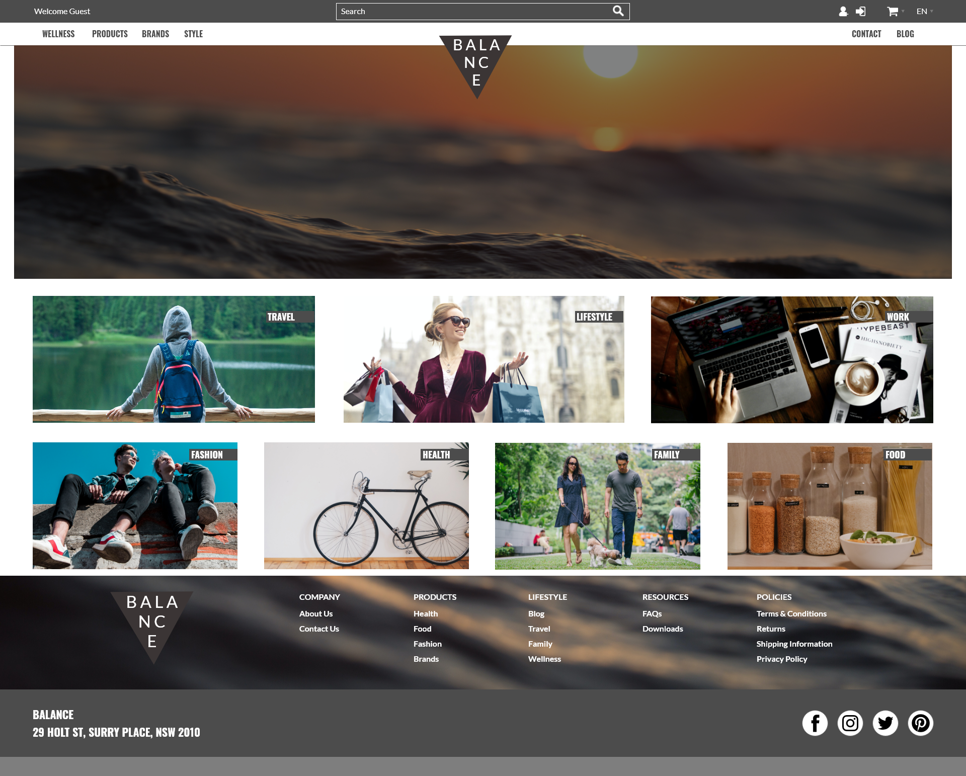
Balance Wireframe
This wireframe was designed to have a header that detailed with a lot of categories but gives a calm balanced experienced by splitting the categories into the left and right side. This also helps the logo remain prominent in the center which is a great call to action. With large banners and category thumbnails, users are able to navigate via the header or by clicking on the image thumbnail of the category. Overall this is a popular design for companies who have a lot of categorised products to display without the categories appearing intrusive in the header.
Benefits/Highlights:
Header:
-Centralised Logo and search.
-Split navigation for maximum categorisation.
-Use of icons for cart, logout and account.
Footer:
-Split footer into 2 main sections for further links and content.
-Text overlay on background for a beautiful aesthetic effect.
-Social icons and address for further outreach.
Category:
-Main banner for further promotional content.
-Filters on the left hand side.
-Grid view default for image heavy content.
Product:
-Main image with description on the right side.
-Product tabs for further categorisation.
Desktop Wireframes


Mobile Wireframes


Classic Wireframe
This Classic design is a basic template with a simplistic layout and experience. It works great for Companies looking to display minimal content or wanting to have a clean and polished aesthetic. With minimal content in the header and footer, a user is easily able to navigate through the site without being bombarded with too much information.
Benefits/Highlights:
Header:
-Thin header including logo, main navigation and search.
-Simple and easy to navigate layout.
Category:
-Left side filters.
-Default list view for category page including images and descriptions.
Footer:
-Spacious footer design to allow for multiple links for extra pages.
-Social icons.
Product:
-Basic page design including product image and description.
-Minimal content and less maintenance.
Desktop Wireframes


Low Fidelty Wireframes for Desktop


Mobile Wireframes


Condensed Wireframe
The Condensed Design is another popular template. The header contains all the information required without appearing too busy and it also allows for as little or as many categorisations as needed by using the dedicated section below the logo. This design is more content focused to attract the user to stay on the page.
Benefits/Highlights:
Footer:
-Basic footer design with minimal content and information.
-Contrast against header design that is detailed.
Header:
-Thin header design to allow for maximum space for other content.
-Separate line for navigations allowing for maximum categorisation.
-Great for logos that are horizontally designed.
Product:
-Detailed product page layout.
-Multiple sections for main image and description content. Contrasts with the category page set up.
-Product tabs for further content categorisation.
Category:
-Maximum space to display products in grid view.
-Great for clients with less products or no need for filtering.
Desktop Wireframes:


Mobile Wireframes:


Pictorial Wireframe
The Pictorial wireframe design speaks volumes to its name. As a very content focused design, it allows for all types of layouts which individually stand out as a user scrolls down the page as seen as in the left home page desktop design. The header is a simple design which overlays the image in a non-intrusive style which stays sticky at the top as the user scrolls down the page. As a content driven site, each page allows for related products and other call to actions to display to encourage the user to purchase and checkout.
Benefits/Highlights:
Footer:
-Simple centralised design containing basic information.
Header:
-Overlay header on main background image.
-Maximum width to allow for more content/navigational information.
Product:
-Detailed product page layout.
-Multiple sections for main image and description content. Contrasts with the category page set up.
-Customers also bought section to prompt users to buy or view more items.
Category:
-Default grid view with filters on the side.
-Pagination and sorting view on the top
Desktop Wireframes:


Mobile Wireframes:


Vector Wireframe
This is another popular design similar to Condensed but with more variety when it come to content layout. With a detailed header and footer, it allows for all content detailed information without taking up retail space. With a sleek black design that has a modern aesthetic, it is easy for companies to apply their colours and branding.
Benefits/Highlights:
Footer:
-Thin footer that is detailed and allows for multiple links.
-Social icon section.
-Logo on the right.
Header:
-Centralised logo.
-Search bar on right.
-Centralised navigation menu to allow for multiple categories.
-Promotional text line (in grey).
Product:
-Large image and space for description and variant product options.
-Small section for product tabs and smaller detailed information.
-Customers also bought section.
Category:
-Main banner for further promotional content along with text.
-Filters on the left hand side.
-Grid view default for image heavy content.
Desktop Wireframes:


Mobile Wireframes:


Urban Wireframe
This wireframe is more type heavy and specific to functionality. With fewer images, users who are familiar with the company can quickly navigate and order their items and quantity very quickly. The home page is uniquely designed to include tabbed information which a user can click through for more information.
Benefits/Highlights:
Footer:
-Split footer into 5 vertical sections for further links and content.
-Social icons and address for further outreach.
Header:
-Thin header which is centralised.
-Prominent search bar.
-Separate line for login and register button.
Product:
-Product calculator for volume based items
-Description section for specification details.
Category:
-Filter left side.
-Line view which is perfect for products with no images.
Desktop Wireframes:


Mobile Wireframes:


