Internal Project: Fronus
Contribution:
I contributed to this project by creating the UI design which included all the different features of the Commercebuild platform. I worked alongside the marketing coordinator to make changes to the design based on the feedback from the management team. I also designed the Fronus (B2C brand) and Cronus (B2B brand) logos which was based on a cronus clock.
Scope:
Create a new template design showcasing different features and elements of the Commercebuild platform. This design is to be used at sales trade shows to demonstrate what the platform can do with a Microsoft Business Central integration.
Design Rationale:
The Fronus/Cronus site was to a furniture based webstore due to the sample products in the Microsoft Business Central being office furniture products. I conducted research into other furniture sites to get a sense of the aesthetic and content layout on which i could base the Fronus site on. A lot of furniture webstores have a pattern of splitting content on the home page into 2 vertical sections. This is what inspired me to create an asymmetrical aesthetic which not only allows featured content to stand out, but it also brings a fresh and unique appearance to the webstore. I also decided to do a text overlay on the images which mimics the flyer layout and design where text is often placed over the top of the image.
Below are the UI Designs for the Fronus (B2C) store and the Cronus (B2B) store.
HOME PAGES

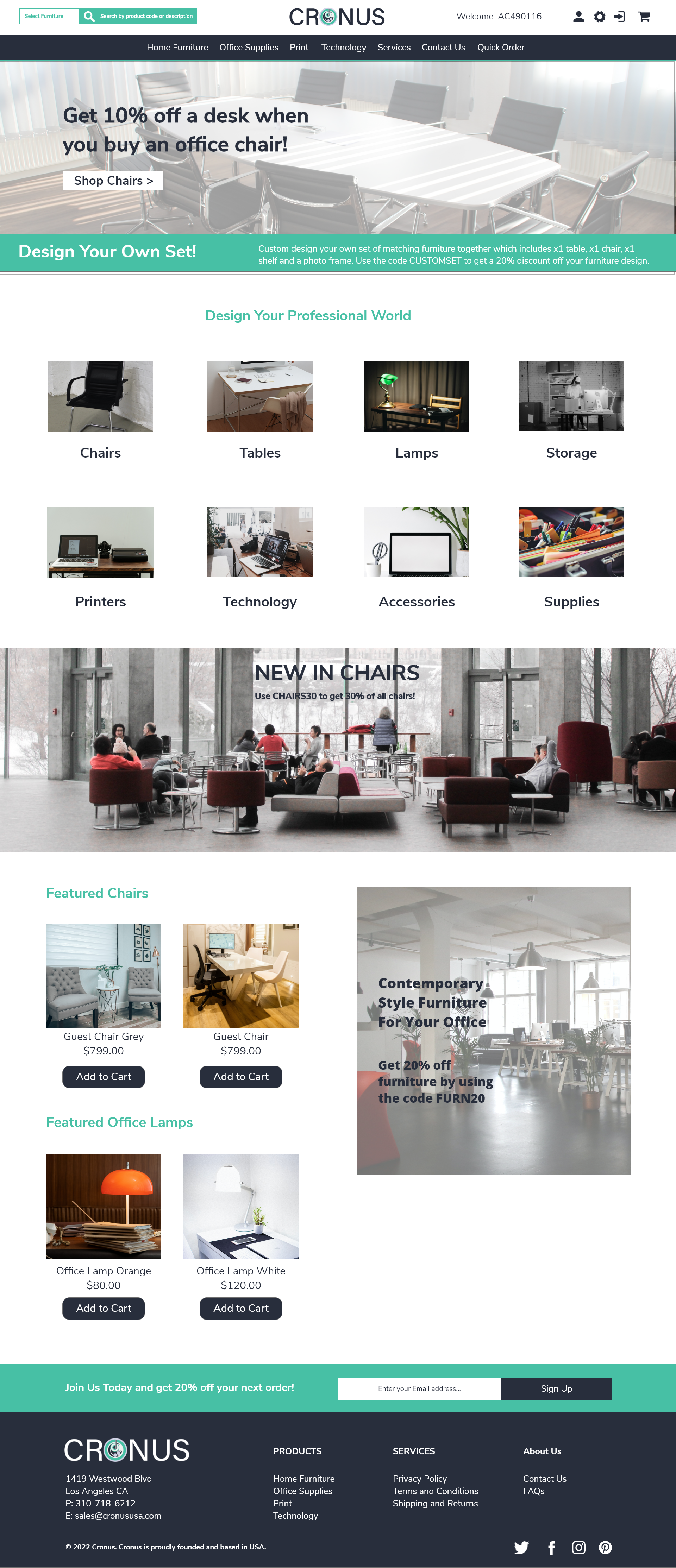
Fronus Home Page
This home page is designed to be a long scroll with multiple sections which are attractive to B2C users to aid them in their search of a product or information.
There is a balance between featured products and featured categories to help prompt the customer into finding what they are looking for. This is also designed to showcase to future clients the different types of content layout that the CMS system can cater for on a home page or any other content pages.
Often B2C home pages include a testimonial and sign up section to prompt customers into becoming a permanent B2B customer.
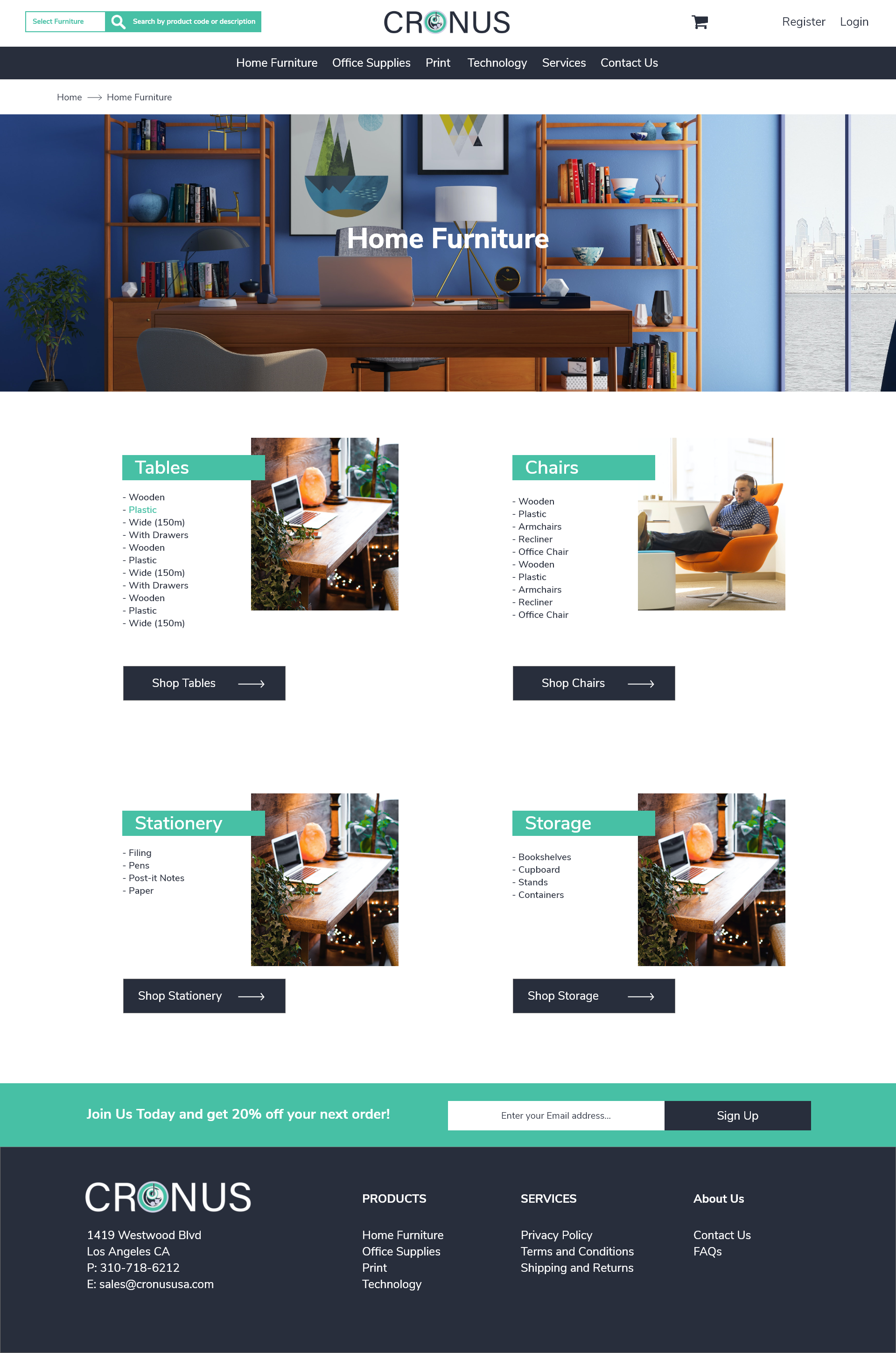
Cronus Home Page
As a contrast to the Fronus home page, this home page is more specific and category focused to tailor to the B2B customer user experience.

Navigation Hover
The navigation is designed to have a mega menu hover where there is an image and title for each category. The background changes for each main category to differentiate between each one.
Category Page Level 1
The level one category page is designed to showcase the variety of sub categories and their respective categories in this unique layout. It not only informs the customer of the potential sub categories but also allows the customer to make the decision of whether they wish to see a specific category or just view more options by clicking the teal category title.

Pop Up
A pop up was designed to demonstrate how pop ups can be used to further attract new customers. I not only designed the pop up in the mockup but also built the pop using the CMS system and styled it using CSS.

Login/Register Page
A unique split screen design to enable the customer to login or register accordingly. The use of the brand colours work seamlessly to create a fresh and harmonious appearance.

Category Page Level 2
This is designed to showcase thumbnails of all the subcategories that are available. This helps to inform the customer what each category is about. This layout is simple and allows the content to stand out.
For further navigation, the customer can use the nav panel in the header or the breadcrumb which is displayed at the top left.

Product Page
This product page is designed to have each content stand out within its own block. The top block displays basic information about the product including images, product code and description as well the price, check stock and add to cart button.
The next section is a further breakdown of the product and has tabs to further split the content up into multiple blocks. This style is handy for sites that have a lot of technical information such as assembly or instructions and even reviews.
The last section is a great way to prompt users to buy or view more items. It could also be used as a related items section to help suggest to users what other products they should buy.